 There’s an old maxim to not judge a book by its cover. But let’s be honest, we do.
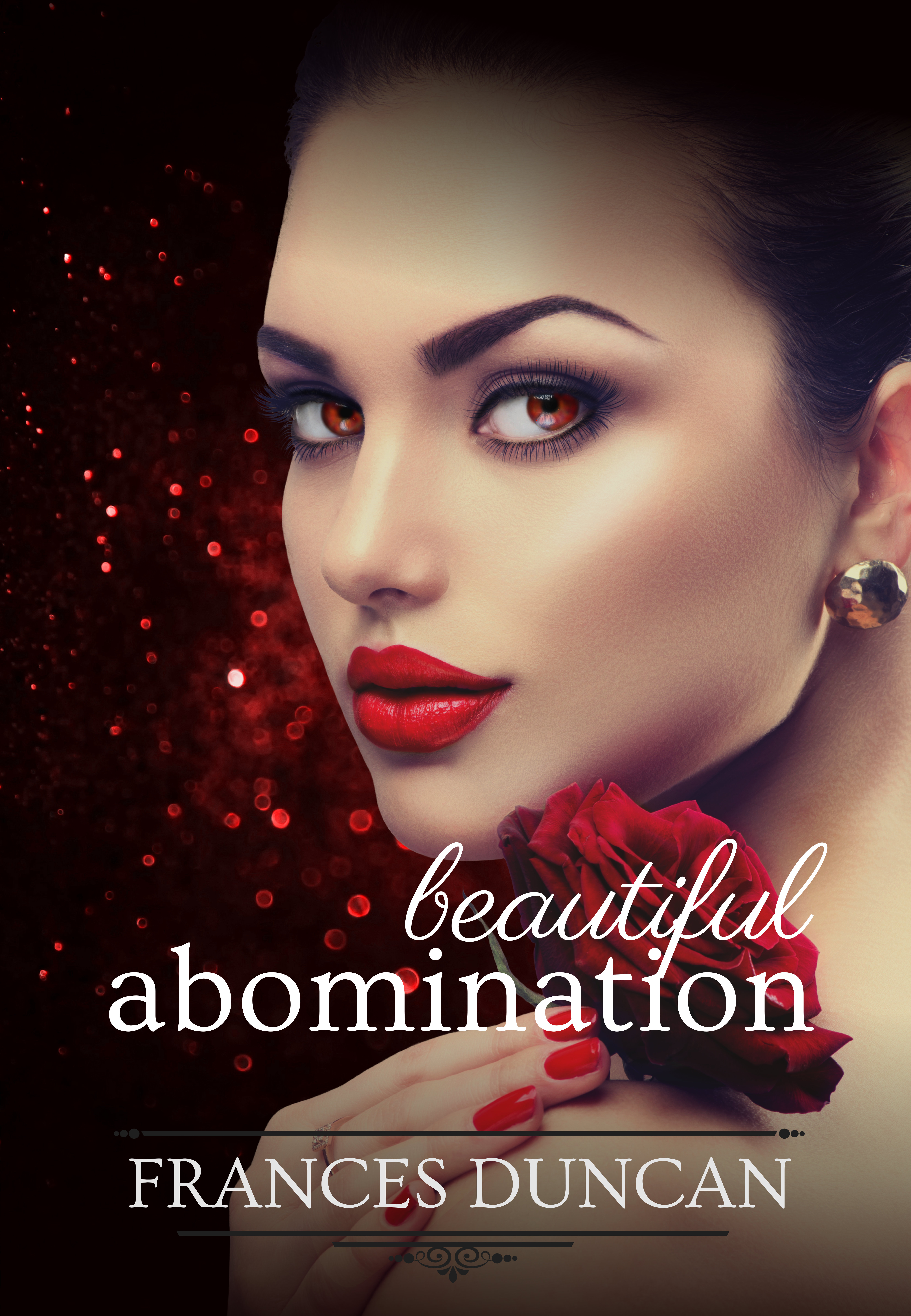
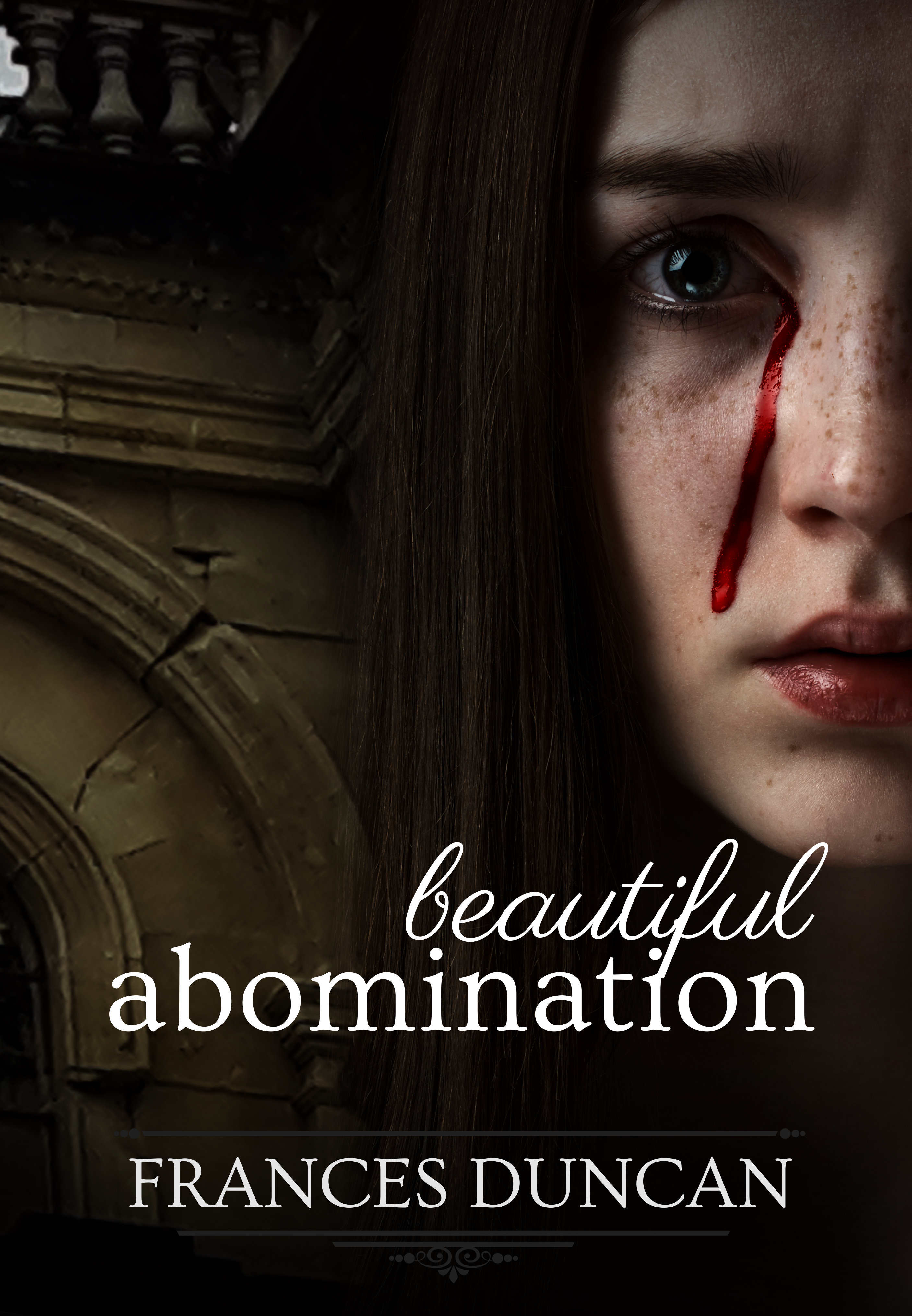
My cover designer, Kate, talked about my latest cover at Lexicon. She used it to illustrate the journey from original cover (left – her design) to final cover (right – a collaborative effort).
The original is gorgeous but not really my style. I wanted something a little dark, a vampire that looked human, and an element to represent the earthquake.
You’ll notice the text remains, in fact the formatting for my name is the same as on my previous book giving a nice continuity (despite the very different genres).

The image on the left is one I took of the Cathedral of the Blessed Sacrament when I was in Christchurch for Word Christchurch last year. The cathedral appears in the book as a sanctuary so I wanted to include an image of its ruins.
The image on the right is one Kate found. It looks much more human than a similar image I found, especially when we removed the red eyes. I loved it so much I rewrote a couple of scenes to make reference to the pouty lips of the model/character.
This cover is perfect for my book and a great example of what you can create when you work together. (If you like the original, contact Kate, she intends to sell it as a pre-made.)
I love them both – I wonder if the one on the left is more appealing to the American audience the one one the right to the NZ/UK audience (we prefer a little grittier).
Interesting theory. I’ll have to ask some people 🙂